Exploding the novel

prosperity cover

February 25 is publication day for my new collection of linked short stories, Prosperity Drive. Jonathan Cape, my publishers, have described the collection, as an exploded novel, which is an apt description since the content has a distinctly boom-time flavour. (The last boom, that is!)

“All the characters in this mesmerising book begin their journeys on Prosperity Drive. Everything radiates out – often internationally – from this suburban Dublin street, and everything eventually returns to it. It is an Ireland in miniature. Like an exploded novel, Prosperity Drive is laid out in stories, linked by its characters who appear and disappear, bump into each other in chance encounters, and join up again through love, marriage or memory.”

Here’s what Hilary Mantel said about it – yes, that Hilary Mantel!

‘Mary Morrissy is a wonderful writer. These stories are entertaining and deft, so skilfully balanced and interwoven that when you begin to pick out the pattern it is a real moment of delight.’

Along with the blurbs the books has garnered, I’m also really delighted with the cover. Originally, the designers were going for a generic image of a suburb, but this is much more arresting – both visually and in its culturally authentic depiction of the book’s landscape. This is unmistakably an Irish suburban street with its bilingual street sign – good to see the Irish language getting equal billing in a UK publication! Also, whether unwitttingly or not, the Irish Tricolour makes a subversive appearance in the cover’s colour scheme – the white of the girl’s tee-shirt, the orange of her skirt, the green of the street sign.  All in all, it’s quite a revolutionary statement. . . See more on: www.penguin.co.uk


Hilary Mantel and me

hilary mantel jpeg

When my novel, The Rising of Bella Casey, came out in late 2013, one of the authors approached to blurb it was Irish novelist and short story writer, Eilis Ni Dhuibhne.  She described me as “the Irish Hilary Mantel”.  I was pretty chuffed about being mentioned in the same breath as Mantel, since I’ve been a long-time admirer of her work – long before Wolf Hall sent her into the literary stratosphere.

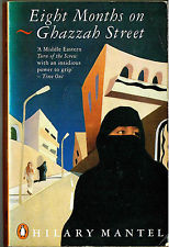
It’s over 25 years ago since I came across Mantel’s third novel  Eight Months on Ghazzah Street.  I was immediately hooked.

The novel tells the story of  Frances Shore, whose husband Andrew, a civil engineer,  is posted to Jeddah in Saudi Arabia on a lucrative building contract. Frances is disturbed by the restrictions the Saudi way of life imposes on her.  She is not allowed to drive; she can’t walk alone in the city without being harassed.  Even in her own apartment there’s a constant reminder of the oppressive burden of the female life in the Middle East.  The front door of the the apartment where she and Andrew live, is walled up – the legacy of the last occupant, a Saudi woman who had to be protected from accidentally encountering a male neighbour on the corridor outside.

Nor is the company of her own kind – the ex-pat community – much comfort to Frances.  “They sat at the back of the plane and got sodden drunk within an hour of takeoff; they squirted each other with duty-free Nina Ricci, and laid hands on the stewardesses, and threw their dinners about, and vomited on the saris of dignified Indian ladies.”

The atmosphere of the novel is perilous, claustrophobic and haunted.  Frances constantly hears footsteps in the apartment overhead that’s supposed to be empty; the motif  has echoes of Bronte’s Mrs Rochester, the madwoman in the attic.  As with the best of novels it’s less about what happens externally as about what happens inside – and in Saudi it’s all inside, if you’re a woman.

ghazzah streetBut what makes Eight Months on Ghazzah Street truly memorable is that it’s as much  about the state of being female – beleaguered, prone to doubt, troubled by shadowy anxieties – as it is about living as a western woman in a Saudi city at a particular time.

I loved this novel  and felt I was the only one who knew about Mantel’s wry and bracing prose, her unflinching eye.  I went on to read many of her books – Beyond Black is one of my favourites, a darkly ambiguous novel about a flakey (or is she?) spiritualist. And there’s Mantel’s  affecting memoir, Giving up the Ghost, which had  particular resonance for me as a fellow sufferer of endometriosis.

When the rest of the world discovered Mantel with Wolf Hall, I have to admit to a tiny sliver of resentment that finally one of my reading secrets was out.

When it came time for my latest collection of linked short stories, Prosperity Drive,  to be promoted (publication date:  February 2016) the publishers asked if there was anyone I’d like to blurb the book. Well, I said, since I’ve been described as the Irish Hilary Mantel, what about the two-time Booker Prize winner?  It was a long shot, but  here’s what came back:

‘Mary Morrissy is a wonderful writer. These stories are entertaining and deft, so skilfully balanced and interwoven that when you begin to pick out the pattern it is a real moment of delight.’

So from one devoted fan of Hilary Mantel – a heartfelt thanks.

Reading the Signs

merton roadseafield

Have you ever examined street signs in Dublin?  I mean those ordinary common-or-garden signs that adorn our gables and walls and serve to tell us where we are – that is if they’re not covered with roving greenery or placed so high up that you get a crick in your neck trying to read them. Those ones.

I hadn’t considered them much, either. Apart from their function, that is, of providing information. But that’s all changed. The reason I’m not only noticing, but examining, street signs – and taking photos of them on my phone – is related to the publication of my forthcoming collection of stories, Prosperity Drive (Jonathan Cape, January 2016).  The eponymous fictional street in Dublin is the triggering location of and the uniting thread running through the stories.

Jonathan Cape’s art department wanted to use an authentic Dublin street sign as part of the cover design. I offered to take some snaps to give them a notion of what they looked like and to alert them to the fact that our street signs are bilingual. I provided them with an Irish  translation for my fictional suburban street.  Or two, in fact.  Prosperity Drive can be rendered as Céide an Rathúnais, but my preferred version is Slí an Rathúnais (literally The Way of Prosperity), because of its clever double meaning. (Some of the stories in Prosperity Drive are set during the Celtic Tiger era.)

When I went looking for an image of the archetypal Dublin street sign, I was faced with a plethora of the current style of sign – white type on a blue background, sometimes with the district number in the right hand corner in reverse – blue on white. (Though with our new super-duper ZIP codes, these old single digits will soon begin to look a bit forlorn.) But what I was looking for was its predecessors.  These were tin, with a garden green background, white lettering and the Irish version of the street name in the old Cló Gaelach. Blame it on nostalgia, but when I was growing up Dublin in the Sixties, these were the standard signs and they remain fixed in my memory as the original and the best.

I didn’t hold out much hope of finding any left – rust and vandalism had surely put paid to them, I thought. But I was pleasantly surprised at how many of them still survive, and I didn’t have to travel very far from my Blackrock base to find them.

My other surprise was to find a huge variation in fonts, style and colours in Dublin street signs. (As an ex sub-editor, fonts, in particular, are a bit of a passion.) As well as the blue and white design, there are also black on yellow signs – particularly in Dún Laoghaire and Monkstown. Perhaps in the early days, each city borough had its own style of sign? I also found a great deal of competing signage. Sometimes – as with Priory Drive in Stillorgan (see below) – there were not only two different styles of signs, but a different Irish translation of the English street name – one at either end of the street.  In later signs – probably from the 1970s onwards, the Cló Gaelach was dispensed with, and the Irish was rendered in Roman script. Then the district numbers were added.

As you can see, I’ve now become a bit of an anorak about street signage. Who cares where I’m going, I’m more interested in what the sign looks like. I thought I’d hunted down every last variation, but it was only when looking at the collection of images on my phone, I noticed that not even the vintage  green signs are consistent. On some, there is a lovely white trim around the edges, which I think looks very classy. So classy I was tempted to indulge in a bit of vandalism myself and lever one of these beauties from its moorings. But I desisted. I’ll stick with my memories and the pantheon of place-names on my phone.

priory drive romanpriory drive